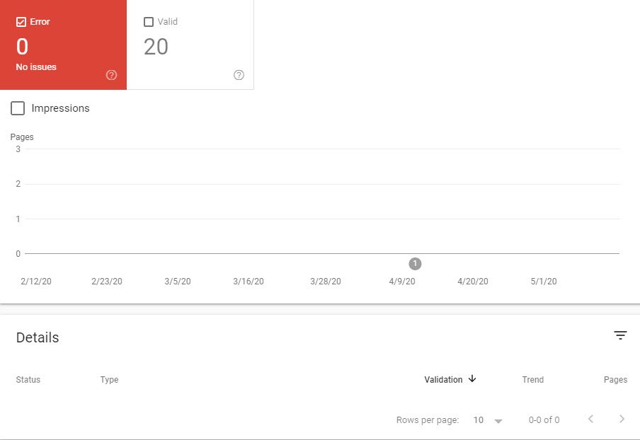
If you go to Google Search Console, you can view what Google sees when it scans your mobile website. Keep in mind, that what the bot view is the code, and not what your users see on the front end. You may discover that your mobile site has all kinds of errors that you never knew existed. The question is, “does it really matter?” After all, why should you invest time and money to fix something that your customers never see?
Let’s delve into that.
Front-end Mobile Issues
Nowadays, these are less common. Most modern websites are mobile-responsive (meaning they change based on the viewing screen). If your site is built using WordPress, chances are, your theme is mobile-friendly. However, older sites may have issues, and even modern sites can have elements that don’t display correctly.
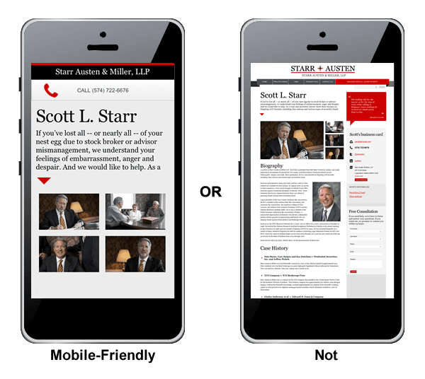
As you can see, the mobile site on the right is basically a minified version of the desktop site. The font is too small to read, and it would be next to impossible to enter information into the form. If you have mobile issues like these, then you will see this kind of message in Google Search Console.
As far as Google (and its ranking algorithm) is concerned, this website does not deliver the best possible user experience. Therefore, when it comes time to “recommend” a site in the search results, a competing company will likely take the number one spot.
Over the past decade, mobile use has grown until it now outranks desktops. Studies show that, even back in 2015, 56% of web searches were conducted from a mobile device. According to a current report from Hitwise, 60 – 72 percent of all Online Searches are now carried out on a mobile device. Google strives to dominate other search engines and to do that, they need to provide the best possible customer experience. That is why mobile errors can have such a profound effect on your Google rankings.
Back-End Mobile Issues
Issues loading resources on the backend of the mobile site can slow down the speed at which your page displays. Even though this is measured in tenths of a second, Google seems to place an emphasis on speed when it comes to ranking. To fully explain the significance of moving to mobile indexing, we need to go through a quick history lesson.
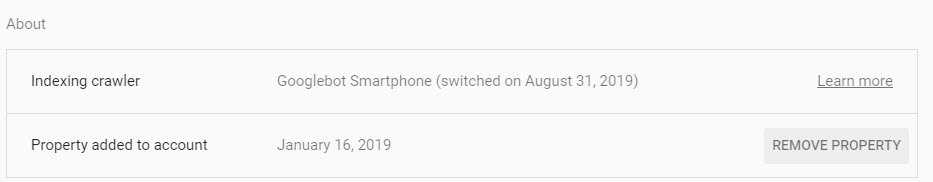
Prior to 2018, Google ranked some sites based on their desktop version and others on their mobile version. As of July 1, 2019, mobile-first indexing was enabled by default for all new websites (meaning all ranking was dependent on their mobile site alone). Google plans to move EVERYONE to mobile indexing by September 2020. Chances are you’ve already been moved. You can find out for sure by going to Google Search Console and clicking on settings.
Even though most sites have already been moved, very few website owners have given much thought to the ramifications. Let’s say, you are an engineering firm. It’s likely that 90% of your traffic comes from desktop searches because most B2B interactions take place at the office. However, that doesn’t matter when it comes to ranking. Your appearance in the search engines will depend on the performance of your mobile site only. So, you will rank based on mobile, and conversions will likely happen on the desktop site. In case you are thinking, “I will just have two versions of my site,” then you need to take a look at Google’s Best Practices for Mobile.
- Make sure that Googlebot can access and render your content
- Make sure that content is the same on desktop and mobile
- Check your structured data
- Put the same metadata on both versions of your site
- Check the placement of your ads
- Evaluate visual content
- Check your images
- Check your videos
As you can see, the only way to ensure your site’s rankings aren’t affected by your mobile site is to build a website that has a mobile responsive version that takes your desktop content and resizes it for mobile. Minor changes may not matter, but the majority of the content must remain the same. This may mean that you have to leave off the video or other fancy features, and opt for a more streamlined version of your site.
Common Mobile Errors
According to Google here are the most common errors it finds on mobile sites that could cause a drop in ranking.
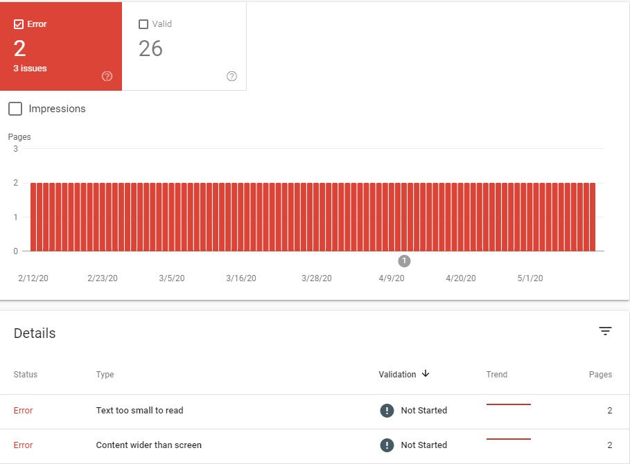
- Missing Structured Data – The mobile page doesn’t have the same schema markup that the desktop page has.
- A
noindextag on mobile pages – Google cannot index a mobile page because of anoindextag. - Missing Image – The mobile page doesn’t have all the same images that the desktop page has.
- Blocked Image – A featured or prominent image on the mobile page is blocked by robots.txt.
- Low-Quality Image – A prominent image on the mobile site is too small or the resolution is too low.
- Missing Alt Text – An important image on the mobile page is missing alt text.
- No Page Title – There is no title tag for a mobile page.
- Missing Meta Description – A mobile page is missing the meta description.
- Mobile 404 Result – The mobile page returns a 404 or other error.
- Anchor Fragment – The mobile URL includes an anchor fragment; Google can’t index URLs that include fragments.
- Blocked Page – The mobile page has been blocked by a robots.txt rule.
- Duplicate Page Target – Multiple desktop pages redirect to the same mobile page.
- Desktop Redirects to Mobile Homepage – Too many pages on your desktop site redirect to the mobile site’s homepage.
- Page Quality Issues – Ads, missing content, or other features have issues that interfere with the user experience.
- Video Issues – The mobile page has a video that is not in a supported format or loads too slowly.
- Hostload Issues – Some of the hosts don’t have enough host load.
We’ve seen a trend towards simpler web designs built for speed and ease of use. Reducing the visual noise seems to resonate with visitors, plus the fewer bells and whistles mean fewer chances for things to “break.” Going forward, it looks like websites need to load in under 3 seconds if they want to satisfy Google’s speed requirements and content must be designed for the small screen.
If your site hasn’t been updated during the past year, you probably need to have it evaluated. Effect Web Agency builds high-performance sites that are mobile-friendly and FAST. We can also work within an existing site to improve performance and resolve mobile issues. Contact us for more information on what you can do to rank higher in the search results.