
When new prospects find your website through Google search, they often come to you not knowing much about your brand. First impressions are therefore very important. Your homepage design needs to be visually appealing and immediately convey a message of “hey, we can help you with XYZ and we are a better choice because…” Studies show that you have about 2-3 seconds to get that across before a visitor will click back out.
How to Build a Better Homepage
We live in a world inundated with visual noise. Ads, media, images, text… it’s everywhere. When you reduce the distractions on a homepage, people respond. The first thing on your homepage should be your “gist statement.” Clearly state who you are and what you can do for them.
1. The way your homepage design looks and feels should match you and your offering.
This is the first judgment they will make. If the homepage design feels right, you are good here. But if, for example, you say you are a cutting edge technology company, but your website looks like it’s from the 80s, then you lose the potential customer. Likewise, if you say you are all about customer service, but it’s hard to find your phone number then that will just not make sense to the visitor and they are gone.
2. You need a concise message to tell them what you do.
Can a visitor easily size up your scope of products and services?
Do you have too much stuff begging them for their attention?
Having a concise message is a factor you control. The best advice is to keep it simple. If you can only get someone to remember three points about your business, what would they be? Anything more is usually perceived as clutter, ignored, or forgotten.
Your customers appreciate it when you keep it simple. It allows them to accomplish their mission: size up and make a decision. Give them the crucial information needed for the type of decision they are making at the moment and no more. In the case of a visitor landing on a homepage, let them size you up quickly with your clear ‘about text’, give them your few and clear differences, and guide them to the next steps.
3. Your difference must be clear.
First, you must be confident that the differences you communicate are actually what they care about. If you’re not, one of the best ways to find out is by asking your best customers “Why do you work with us?”. Does their answer line up with your messaging? Once you settle that, only try to communicate your top two or three differences.
How different are you really? Would you say “We sell heating and cooling products and services”? While that categorize you in the realm of being a possible provider, that statement offers no reason for the visitor to choose you over anyone else. If your main difference is quick service, a better way of saying it might be, “The only heating and cooling company with next day service in the tri-state area.” That will give your visitors the information they need to decide whether or not they will invest more time on your website.
The Ultimate Goal Is Online Lead Generation
Since the majority of people enter a website via the homepage, you need to have clearly defined user paths to move them from the homepage, through the site, and ultimately to where you want them to make a conversion. That could be a sale or more likely, a request for follow-up.
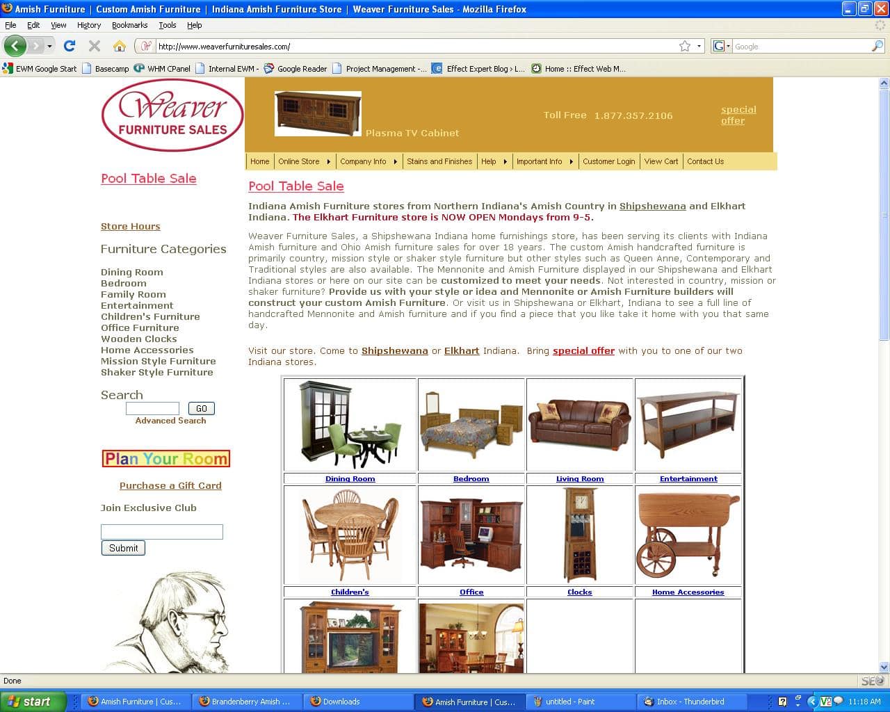
A great example of this can be found on a site designed by Effect. This company specializes in handcrafted Amish furniture and operates in Northern Indiana.
To formulate a strategy for their new site we first looked at the site of one of their older brands. We noticed was that the homepage was content-heavy and there was no clear funnel or path for visitors. The ultimate goal was, of course, a sale, but the primary purpose of any site is online lead generation.
First, we helped the client define the top three main goals for the new site.
- Drive more foot traffic to their brick and mortar store.
- Have people browse their online catalog and submit a request for a quote.
- Capture prospective customers’ information in the email newsletter sign up form.
Please note that none of their goals for the website included taking sales ON THE WEBSITE. Two of the three were solely for the purpose of online lead generation.
Conversion-Focused Homepage Design
We first utilized their beautiful photos to create an engaging slideshow on the homepage to confirm to visitors that they were in the right place for quality, hand-crafted Amish furniture. We then set up three doors or entry points into the site that would guide the visitors to the next step in their journey.
The three entry points on the homepage graphically represented the client’s goals. A navigation menu was intentionally left off the design to better funnel the users to the three goals. We also set up a tracking code on the three goal-areas to measure valuable information about the visitors and their behavior on the site.
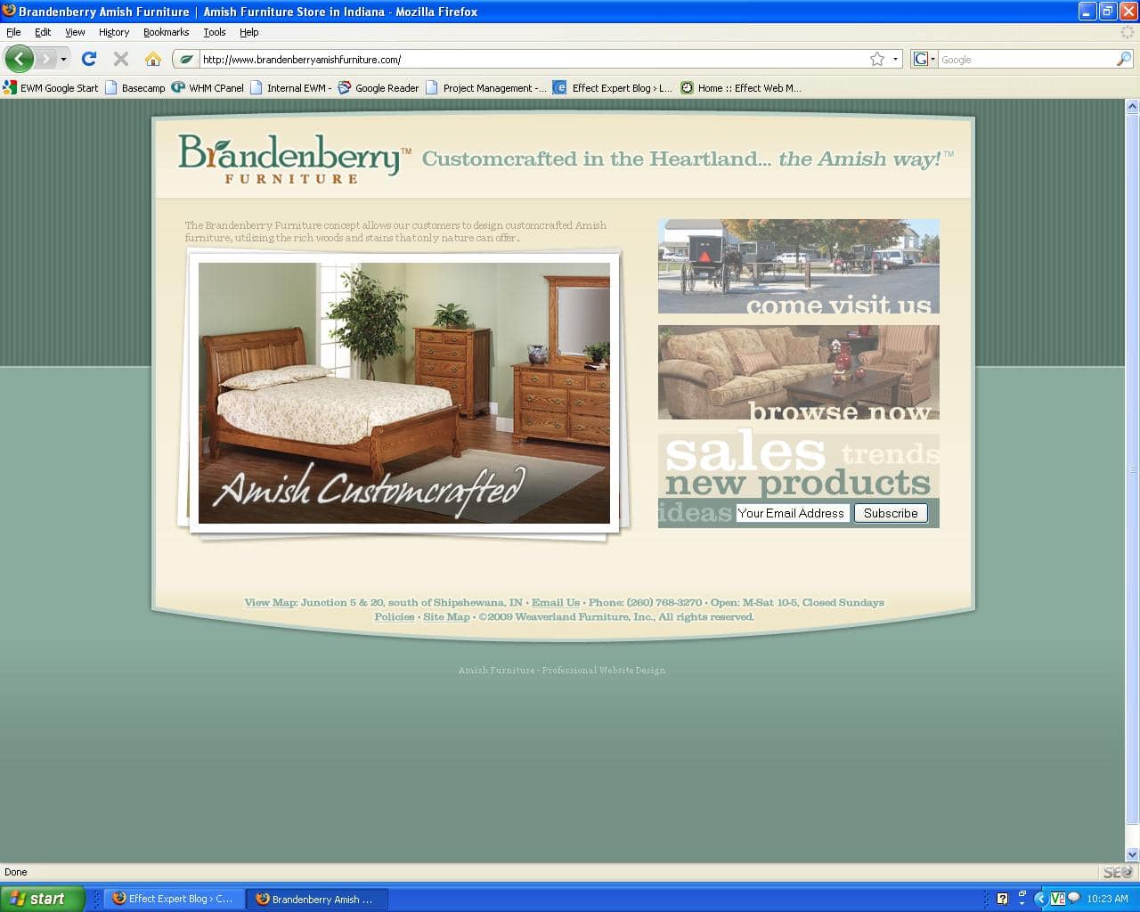
The result was an easy-to-navigate, beautiful site that was able to meet the client’s goals and needs. With web analytics, we were able to see that the site had a low bounce rate. This confirmed that the path to the next step was clear.
Effect Web Agency builds websites that not only look good but are tools for growth. If you are looking for a better performing website or a strategic web strategy, call Effect. We have offices in Indiana and Kansas. Effect Web Agency serves local, regional, national, and international businesses from small businesses to large corporations.