Our Client
Better Tools seeks to disrupt the current hand tool market by capturing consumer loyalty and market share and driving sales for their retail partners. Founded in 2004, they produce the legendary Grip-Tite line of sockets and wrenches, along with Hippo Tool Storage Solutions.
Their Website Goals
The goals for the new Better Tools site were clearly defined. The company had recently re-branded and wanted to present a strong brand identity and have a simple site, that prioritized their visitor’s needs and would allow them the ability to add additional lines in the future, without having to undergo another redesign.
The Project
A Simple and Visual Web Design
To achieve the goals of our client, we knew we needed to create a simple and engaging website. We also wanted to make it easy to navigate and visual in nature. We started by redesigning the company logo to create strong branding that Better Tools wanted. In addition to their new logo, we also crafted a gist statement that summed up the company as a whole and promised to resonate with their customers. The final step was to build a website that could be expanded in the future to include new product lines as needed.
https://youtu.be/WfeuWF-BOAM
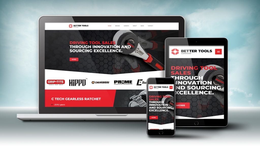
1. New Logo Design Defines the Brand
The hex nut shape used for their logo image defines Better Tools’ applications and identity. This strong and precise branding sets the tone for the overall web design. Bold colors further strengthen the visual impact of the new logo.
![]()
2. Gist Statement Sums Up Their Mission
The Gist Statement is the first thing that web visitors see when they land on the site and it sums up who the company is and their mission.
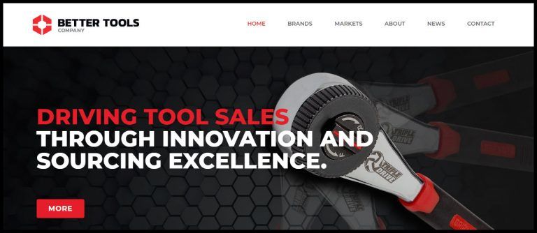
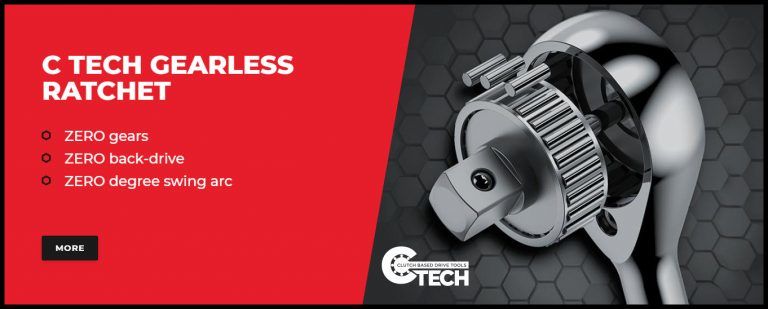
3. Visual Web Design Engages Visitors
Rather than use a slider at the top of the landing page, we chose to make the slides static. This way the important points were not lost during the animation. Each slide, or section, highlights the features and benefits of the item displayed. The bold colors and distinctive images draw the eye even though the presentation looks clean and simple.
4. Content that Addresses Customer Priorities
The final and arguably most important element of this web design project was the content. Great care was taken to outline the benefits of the products based on what the customers care about and to present them in the order of priority. This way the company can show that they understand the needs of their retailers and that they work hard to meet those needs.
Quotable Insights
“To deliver the most impact, we need to make the page interesting to the visitor and prioritize what they care about the most.”
If you would like to learn more about the Better Tools web design or how you can have a website that helps achieve your company’s goals contact Effect Web Agency for a free consultation.
![]()